Wednesday, August 03, 2005
Aging for Illustration Friday

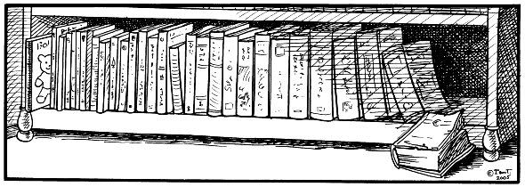
This was a challenge! J said, "You could just draw a pile of dust." :)
Jill suggested that the books should start off smaller (good idea, but it was too late) and also that maybe the last book could be more decaying, but I replied that "It's aging, not death."
Jill and J both thought that I should use real book titles, but I resisted as I thought that kind of restricted the idea (and they'd probably be unreadable in the online version anyway. J says they look like they're written in Chinese - maybe they are...
Labels: Illustration Friday, Sketchbook
Comments:
Clever take on the theme...and I REALLY like your drawing here. You say a lot with just black pen strokes. Nice work!
I love this drawing! It appeals to my bookish side. I like the way you've depicted the progression of lit. interests - sandwiched between a slim child's volume and the thick, mature tome. Personally, I find myself going from "right to left" in my reading interests. The older I get the more drawn to youthful literature I become.
Sounds like this illustration is a combined family effort :) It has a traditional feel and if there wasn't a title or topic - a subtle message which is often difficult to do. I really like this one :)
This really hit home. I have been reading SALT a world history which is about the size of the last book, and also reading Once Upon a Potty to my 2 year old grandson which is about the size of the first book, so I was really taken with this picture. Great job, great fun. The crosshatching is wonderful, that may sound weird, but I do awful crosshatching, so I always appreciate when it's done really well and it is on your picture. I just love the whole thing.
I love, love this idea. Being a former English major,a teacher, a parent and a person who reads children's books on a more than regular basis, I really enjoy the idea of books becoming a pattern in all parts of life. Great stuff!
Very nice. The 'aged' book looks like it's been read many times, maybe travelled the world and seen a lot of life. It looks like it's accumulated a lot of experiences.Perhaps about to be read again or read anew.
there's nothing better than a shelf filled with old treasures and fond memories...remembering how you felt when you read something special that evoked strong feelings...great sketch!
cheers,
kerry
cheers,
kerry
Your drawing is great! The shadows have made it perfect or I feel like looking at it early morning where there is a bit light coming in. I like the bear book popping out of the bookshelf and the old aging books and how can they still stand just like the other books.
This is a wonderfully different take on the aging theme! I like the idea that the book of our lives becomes thicker as we grow older; not just because of the accumulated experiences, but also because of how we tend to complicate everything! Then there's the little teddy bear playfully peeking out to see what the future holds...ah ha...a fallen book! You do such lovely work!
great concept & pic! We read "Courderoy" when we're born & by the time we get to "War & Peace" it bores us to death ;)
Concept! Wow! A concept can take you so far in illustration. A beautiful, simple piece that says so much. Great job.
Thanks all! I'm really pleased that the concept I was trying to get across actually worked, and also had nuances I hadn't really thought about :).
My initial idea was that the books would present the passage of life, with knowledge gradually growing, even as the physical form becomes more timeworn.
Jacque, I tend to avoid crosshatching because my early comics were criticised for it, but I do think it's a legitimate black and white illustration method, and one that I'm still fond of using now and then.
In many ways Corduroy can tell us about aspects of the human condition as well as War and Peace :).
Post a Comment
My initial idea was that the books would present the passage of life, with knowledge gradually growing, even as the physical form becomes more timeworn.
Jacque, I tend to avoid crosshatching because my early comics were criticised for it, but I do think it's a legitimate black and white illustration method, and one that I'm still fond of using now and then.
In many ways Corduroy can tell us about aspects of the human condition as well as War and Peace :).


