Wednesday, February 08, 2006
Chair for Illustration Friday

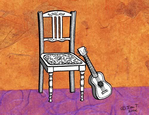
It's looks like the run of esoteric concepts at Illustration Friday has given way to more woody topics - this week, it's "Chair."
Chairs can tell plenty about the human condition, designed as they are to fit the human body in a semi-relaxed (not necessarily ergonomic) position, for people pursuing a range of tasks, or just relaxing. Why electric chairs though? I mean, if you're being executed, is comfort considered to be an issue? Bizarre!
This picture is from part of a cover sketch I was working on for a small independent comics compilation. I got bogged down in the details of the main part of it, but it may still get used. In any case, I have the covers kiss of death, having drawn two others in the last few years, only to have the respective comics cease. I'm actually working on another cover for another comic right now, so fingers crossed...
I digress - there's a certain look I wanted to achieve here - with a fair bit of detail in the linework, but not too much. While working on this, I was reminded of lots of furniture illustrations I did years ago - back in my first marriage - when I was trying to supplement supporting a family on a pathetic salary by going around local printers looking for drawing work. Recently, I've had to knock back a number of paid small drawing jobs due to lack of time - it's frustrating, but a good problem to have, and I'm happy concentrating on my ongoing comics projects (around work and family life).
Labels: Illustration Friday, Sketchbook
Comments:
This is really cheerful - I like the contrast of chair and ukelele in black and white to your bright colors and handmade paper texture. Plus I wonder who was playing and just went to get a glass of lemonade....
I really like your color choices here - great background and nice line work. I really also like the sense of anticipation that this illustration evokes - you're either waiting for the musician to arrive, or hoping they'll come back soon.
I always enjoy reading your posts and getting your perspective on life. Nicely done Ian - hope this one pans out for you...
I always enjoy reading your posts and getting your perspective on life. Nicely done Ian - hope this one pans out for you...
Nice job, Ian T. I'm glad for the more concrete - er, woody - theme as well. This is a sweet l'il sketch.
Love the added rice paper colour and texture! Nice detail in your black and white drawing - artistic portrait of chair user :)
very interesting picture-I wonder if the person, who uses this chair and plays the instrument-would be in black and white, or color, if he or she suddenly appeared in the scene? Anyway beautiful color and black and white design
This is so nice, Ian! I really like the combination of detailed linework and strong graphic composition. The guitar leaning against the chair is such a great touch! The texture and colors of the background make me think of a brightly painted stucco building in some sunny place...the chair seems to be waiting for someone to sit and strum as people pass by.
I like this. It has an Old World feel to it. I think it's the wall, the ornate carving and the guitar combined. Wonderful!
Good luck with the comic. :0)
Good luck with the comic. :0)
really very neat! i like the colors you have chosen that has made the black and white drawing of the chair and the musical instrument become more beautiful. it has captured the message of the importance of a chair especially to that person who's going to play the instrument.
i love reading your posts, too!
i love reading your posts, too!
I was listening to blind willie johnson as the page opened up so the guitar fitted right in to what i was hearing. Nice textures!
Post a Comment

