Saturday, August 12, 2006
Cafepress shop
 You might have noticed in the Links that, a while ago, I set up a small Cafe Press shop. Mostly, I wanted to experiment with putting some designs onto various goods, to see how the process worked and how they came out. Earlier this week, I received a box of stuff that I'd ordered, and the results are good!
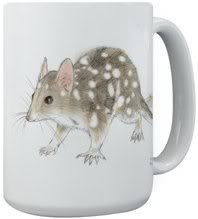
A good example is the Eastern Quoll mug at left. This design came out perfectly on the large mug - in fact, so well, I've put it onto the small mug as well and will be ordering some more as presents (the large mug is pretty heavy though, so I think the small may turn out to be preferable). I think the trick is combining the right picture with the right printable product.
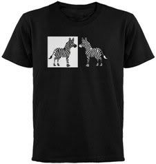 However, there is a bit of learning curve to getting this right, particularly with some products. The black and white Zebra T-shirt required cutting away all the black areas, so these aren't printed and the black fabric shows through. The result looks great, though I had left a tiny white line framing the right hand picture in my first run (which I've now removed), and I've also made the T-shirt size smaller. J was really happy with this one, as she says this is a favourite picture of hers.
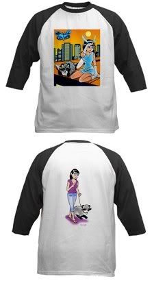 All the pictures here are of what I actually ordered (and received). This Moth & Tanuki baseball jersey came out beautifully - the printing of the front looks better than it does on paper!
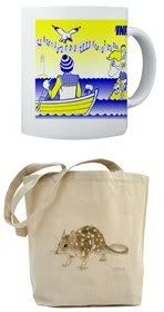 What Didn't Quite Work
Well, a couple of things didn't come out as I'd hoped, due to no fault of Cafepress (they've been removed and replaced with other items). The Ink #3 graphic just looked too cramped on a small mug, and some of the colours had consequently been muted and bled a little.
The Quoll Tote Bag didn't work because the delicate picture faded away into the colour and texture of the bag (the opposite to the mug, where the same picture worked brilliantly).
I'll be adding some other items soon, and quite a few friends also have CafePress stores, such as Tonia Walden's Art Puppets Shop.
Comments:
I love the way these things look! I think the quoll tote bag is beautiful! You are scrutinizing every detail and really want it to stand out and I can dig it but I love the subtlety of this bag!Really cool stuff!!!

I think it all looks very good. If I was in the market for a good tote bag, I'd certainly consider yours. :)
the OTHER Ian
Post a Comment
the OTHER Ian
![]()