Wednesday, November 02, 2005
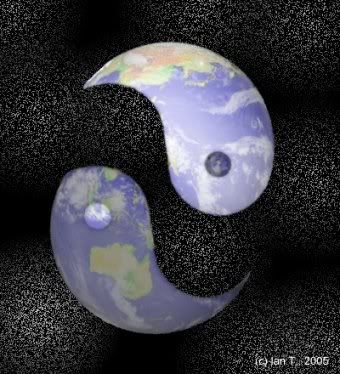
Broken for Illustration Friday

This week I had a number of ideas for the concept, so I decided to combine two of them into a simple picture made in Paintshop. At first, I thought about drawing this, but I think it actually works better this way - simpler and clearer - and I already drew a map by hand last week :).
Labels: Illustration Friday
Comments:
I like how the two parts are soft and gentle looking; glowing with kindness for our subconsciousness :)
WOW, what a wonderful take on the theme. I like that the background has some texture but doesn't compete with the images. wonderful idea and execution.
Ian, I like this philosophical observation and how you've illustrated it. The background looks like the cosmos...in truth, although we are so small in relation to the universe, our world is all we have. Time to balance things properly and be whole again.
Great illustration Ian - I like th concept and execution. Cool lights and shadows, nice texture too. Great job!
Thanks for all the comments. The Unknown and Carla - you've got what I'd intended, though it's definitely an image that can be read a number of ways.
Yep, the Yin and Yang of the World today are wildly out of balance. Of course, in their nature they are very tied to the World as it should be - the day/night duality, transformation, integration and ideal balance - but that's not how it's going currently at all...
Yep, the Yin and Yang of the World today are wildly out of balance. Of course, in their nature they are very tied to the World as it should be - the day/night duality, transformation, integration and ideal balance - but that's not how it's going currently at all...
Hi Ian,
You had asked about Flash being bought by another company...In a nutshell:
Adobe (the makers of Photoshop, Illustrator, InDesign and Acrobat) bought Macromedia (Flash, Dreamweaver, Fireworks, Freehand). The main reason given for the purchase by Adobe was so they could integrate the PDF format of Acrobat with the SWF format of Flash. Both products' players have an incredibly high penetration on computers (somewhere around 98%)but neither product played well with the other. Now you have the combination of the two major players in the graphic/web design field becoming one company. I don't see how limiting the competition through a merger can possibly be good for the consumer. Of course, no-one asked me.
Sorry if that's more than you wanted to know.
Thanks, Tony! Hmm, Adobe, it could be worse, I suppose, though I'm not a big fan of PDFs as a format...
Post a Comment


