Saturday, May 13, 2006
What Bugs Me About the New Ladybird Books
 A Review of Some "New" Ladybird books
"These are the original Ladybird retellings, with beautiful new pictures of the kind children like best - full of richness and detail"
- (from the back cover of the current editions)
Hmm, well no, they're not really the original retellings, the pictures aren't exactly new, and the richness of detail is very much diminished from the true originals.
When we were in Borders a few days ago, Jill pointed these new Ladybird books out to me, and we got down the old versions at home to compare.
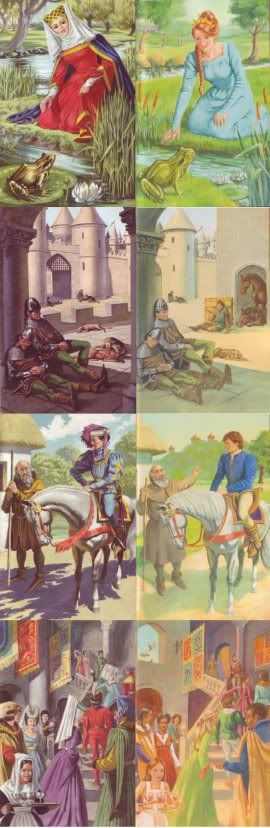
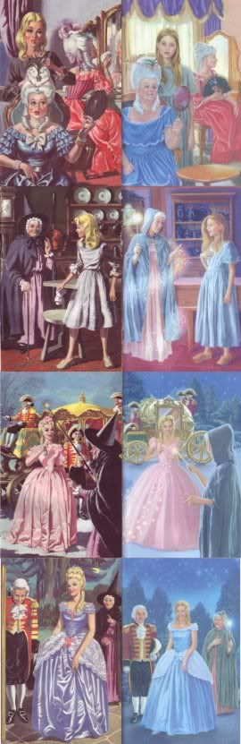
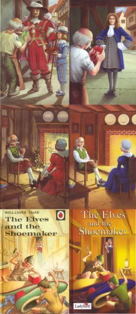
In the left columns of these pictures, you'll find some (fairly randomly selected) pages from the old (1964 & 1965) Ladybird editions of Sleeping Beauty, Cinderella and The Elves and the Shoemaker, illustrated by Eric Winter (the first two) and Robert Lumley. To the right of each are pictures from the new Ladybird books of the same titles, by new (credited) illustrators. Nowhere is there any mention of Winter or Lumley.
The startling similarities between the compositions and much of the detail in the two sets of illustrations is doubtless intentional - I have to wonder what sort of brief the new illustrators were given for this assignment. Interim editions did feature entirely new illustrations, but the latest ones are very evidently drawn on the editions from the sixties.
I'll return to the illustrations further down.
Now to the writing... The authorship is still credited to Vera Southgate, M.A., B. Com., but - in contradiction of the claimed "original Ladybird retellings," these have been edited fairly substantially in places.
With entire sentences merged or altered, and much dialogue removed, the overall the feeling is of Bowdlerisation - a removal of a fair amount of subtlety and resonance (not to mention several pages in each book). Originally, this Ladybird Series, 606D, was a series of graded "Easy Reading" books set at different levels. Page count cuts and the need to standardise the level of the text in some cases may have been factors, but the author statement remains unchanged (with no statement regarding editor).
 Parts of the alterations of both text and illustration are evidently for the purpose of modern sanitisation. In the case of Cinderella for example, the opening changes "elder sisters" to "stepsisters."
Some illustrative examples (see below) are the removal of the Shoemaker's pipe and the replacement of his unsafe candle with a lamp. And then there's the neat-as-a pin look of the Elves' clothes - not a patch in sight anymore - although their clothing remains described as "old" and "ragged" in the text.
The illustrations in the new versions have lost a lot of detail (ie: compare Cinderella's dresses, or the plates in the background of the Shoemaker's house), not to mention character. In addition, they seem to draw from the original illustrations in a grimly literal way that stifles the potential creativity of the new artists.
Sometimes it appears that the illustrators failed to properly comprehend the original picture they were emulating, but place a hand gesture or object there in any case. Most fascinating of all are the small touches, such as the Lady second-from-left in the bottom Sleeping Beauty picture above, whose hair is shaped to recreate the headpiece of the Lady in the earlier picture. And the Shoemaker's wife remains taller in the cover picture (below), as it slavishly recreates the older picture - in the earlier book she was in fact taller, but in the new edition, apart from this picture, she is shorter than the Shoemaker.
With only one source, buildings and costumes lose those pesky augmentations and become blurry - much is lost and nothing appears to be gained (apart from an updated look). Worse, the sense of historical setting carefully composed in the originals has become a hotch-potch of styles and periods.
Building and character elements are sometimes moved around or even merged (parts of two older pictures being used to construct the "new" one).
Another modern touch is the portrayal of characters, both the lead roles and supporting characters, as being much younger (most evident in the Cinderella).
That said, Ladybird books are still a fine format, the retellings are better than average (even for having been altered to their detriment), and the illustrations better than typically cartoony fairy-tale hackwork. Most of the credit for the illustrations must remain with the uncredited Winter and Lumley though - the artists responsible for those original visions, compositions and details.
With more titles yet to be reworked in this series, we'll be watching with interest...
(Images Copyright, Ladybird Books Ltd.)
Labels: Children's books
Comments:
I agree regarding the illustrations. Another thing is that both the fairy godmother in the updated Cinderella, and the final updated blue Cinderella ball gown, are direct ripoffs from Disney's version of the fairytale.

I don't know if I ever read this series, but I did read many beautifully illustrated fairy tales as a child. I always loved the intricate artwork, the details of the setting, the quirks of the characters. I was really fascinated by your review of the new Ladybird Books. The changes you described are so symptomatic of the politically, psychologically, physiologically, etc. correct approach that our generation has chosen to take with our children. Ultimately, we present kids with a bland, safe, unchallenging version of reality; we insulate them against the "dark side," and then expect that somehow they will emerge stronger and more positive than we did. I'm not sure it works. Anyway...the original illustrations are really fine, and make me want to track down some of the old books! The new illustration do have, as Aravis points out, a real Disney vibe.
Hey - thanks for your visits and comments this week. I have only seen the director's cut of Blade Runner, although I've read parts of the scipt for one of the commercial releases. I actually want to purchase a DVD that has both, so I can do a "compare and contrast" with my film class. I was also so touched by your comments on my reunion gals! It made me feel wonderful coming from such a talented artist...thanks! They are based on real people Jol and I saw at those very concerts, although "Soccer Rhonda" is a composite of a type we see around here all the time. Rhonda is notorious for parking her huge SUV in the fire lane so she can run into Starbucks (all the while chatting away on her cell phone) to get her grande nonfat latte before picking up the kids at their various practices and lessons, etc. Ugh...don't even get me started!
Anyway...hope to see you around IF. Penelope redesigned the site, and it looks great. It's still impossible to get through all of the submissions, so I think I'm going to subscribe to bloglines and just visit the people whose work I enjoy. Take care:>
*LOL* I started to say that I see those same SUV soccer moms on cell phones where I live, and then remembered I live in the same small state. Duh! *G*
Aravis, you are so right about the similarities to Disney's Cinderella! This may well be subconscious on the part of the artist, but the editor should have picked it up - or maybe people's expectations these days are of Disneyfication (of so many stories).
Carla, I should have said that J and L really enjoy the original versions of these Ladybirds and my feeling is that the publisher would have done easily as well simply republishing them in their original form (although this would mean loss of work to current artists).
On IF I just can't seem to get motivated about any of the recent topics, even though they're things I might normally draw. It's ironic - I formerly complained about the topics being too esoteric, but now they're so concrete they're a bit stifling. But really, I'm going through a patch of not feeling motivated to draw at all, partly as I've run out of deadlines for now.
IF is so big now! I don't know about bloglines - is it like LiveJournal Friends? Usually, I try to look at many of the same artists, but with a few random ones as well.
I like this week's topic but have caught a cold and am having trouble focusing, let alone painting. I take it now week by week rather than forcing myself to participate all the time. I think I've got a touch of OCD, and can put too much pressure on myself to the point where it stops being fun. So now I pick and choose and am much happier.
Have you noticed the new thumbnails and categories on the home page? That might make it easier to sift through entries to find what interests you. I use Bloglines to notify me when someone posts to the blog feeds I'm subscribed to. You can read entries on the feed or follow the link it provides to go to the blog itself to leave a comment. As for the IF feed at Bloglines, when I tried it today it gave links to each new submission, but didn't show the artwork. That may have been a tech glitch with Bloglines, or it may be that this feed doesn't show images. In the end, I decided that for me it would be easier to just view the thumbnails on the IF site...
Have you noticed the new thumbnails and categories on the home page? That might make it easier to sift through entries to find what interests you. I use Bloglines to notify me when someone posts to the blog feeds I'm subscribed to. You can read entries on the feed or follow the link it provides to go to the blog itself to leave a comment. As for the IF feed at Bloglines, when I tried it today it gave links to each new submission, but didn't show the artwork. That may have been a tech glitch with Bloglines, or it may be that this feed doesn't show images. In the end, I decided that for me it would be easier to just view the thumbnails on the IF site...
Aravis, I haven't checked out the new IF setup properly yet, but I'm not sure I like the category arrangement.
Something else I meant to say about those Ladybird books, is that many of them are like two dimensional pictures of pictures, rather than pictures in their own right.
Something else I meant to say about those Ladybird books, is that many of them are like two dimensional pictures of pictures, rather than pictures in their own right.
Yes, 2D images of pictures is exactly what they look like. I found this fascinating - they appear to be not different, stylistically enough, to warrant doing, but have just lost the freshness of the originals. The brief was probably to maintain the Ladybird look so as to retain parent and grandparent purchase but pastelise and freshen the images for today's child reader.
Congratulations for keeping your old books. We had hundreds of originals in the sixties but my younger brothers got the trash and treasure bug in the seventies and flogged them all off, along with half the family's toy collection, fifties wind-up racers, balsa boats and planes, early Matchbox, you name it.
kitchen hand
I'm not a fan of the categories either, but there were several members who called for it in the forums. They didn't want to "waste time" looking at digital images or drawings by children. The new thumbnails and categories allows them to find the type of thing they like more quickly and, I suppose, gets them off of Penelope's back. :0(
As for the Ladybird pics, I think you nailed it when you said that they are just pictures of pictures, and the originals have more depth. I would much sooner buy the originals than the new.
As for the Ladybird pics, I think you nailed it when you said that they are just pictures of pictures, and the originals have more depth. I would much sooner buy the originals than the new.
Very true, the originals are much, much nicer in every aspect. The same sort of thing seems to have happened with Richard Scarry's big book....
# posted by  : 12:45 pm, November 13, 2006
: 12:45 pm, November 13, 2006
Hi, I know this post was written some years ago, but I would like to defend the newer artists. I'm afaird that you have no idea that the publishers where very clear to the new artists that the images must look similar, in order to know that they would sell. Make sense?
I also happen to know that yes the leads in Cinderella do look much younger than I the books before, the girl is a teen, not a full 20 year old woman like in the one before and the fairy godmother was clearly in the previous book. And is you actually read the book, she was meant to be wearing a blue dress. The final night she wore white/gold dress. As it is stated in the book.
Please also consider that the art you are naming is someone work and should be look upon as an achievement regardless if you like it or not.
I don't know if your ever going to read this. I hope you do.
xo
# posted by : 10:09 am, August 05, 2014
: 10:09 am, August 05, 2014
First off, thanks for writing. I don't think artists should have to defend their work from reviewers (and I speak from both sides of that).
You wrote:
"you have no idea that the publishers where very clear to the new artists that the images must look similar"
In my discussion, you'll see that I pondered that exact question: "I have to wonder what sort of brief the new illustrators were given for this assignment."
Well, you've answered that, and my criticism certainly lies with the publisher/editor in this case. I think the illustrators have clearly met the brief given to them, but I find the transcription of the work of other (uncredited) illustrators, really troubling.
I'm not sure why you bring up the colour of Cinderella's dress, but I am pleased that her ballgown isn't the (usual these days) Disney blue. The shifting of age from an older teen to a younger one I figure was also directed by the editor, to give the book a more contemporary feel.
The illustrations certainly have their appeal, and are competently done. I just feel that, had the illustrator (whether you, or someone else), been given the freedom to illustrate "in the tradition of" those originals, rather than rework them, that would have given more freedom to create a lasting result.
Something strange happens when you make an illustration from a two dimensional source - it's the creation of a picture of a picture, rather than a picture of the three dimensional object it represents. I did a transcription of a Monet painting once that really brought this home to me.
I have read the books carefully - please note my comments on the differences in the new text.
I'm sorry if this is unduly harsh. If I was writing it now, I'd probably be gentler. From what you say, my criticisms must rest with the editor of this series. It's certainly not a failure by any means, and I do prefer this style of illustration to many of the other recent versions of these tales.
However, I would like to see due credit given to both the current illustrators, and the past ones on which these illustrations have been based. But then, I have that problem with a lot of modern art, music and illustration.
Post a Comment
You wrote:
"you have no idea that the publishers where very clear to the new artists that the images must look similar"
In my discussion, you'll see that I pondered that exact question: "I have to wonder what sort of brief the new illustrators were given for this assignment."
Well, you've answered that, and my criticism certainly lies with the publisher/editor in this case. I think the illustrators have clearly met the brief given to them, but I find the transcription of the work of other (uncredited) illustrators, really troubling.
I'm not sure why you bring up the colour of Cinderella's dress, but I am pleased that her ballgown isn't the (usual these days) Disney blue. The shifting of age from an older teen to a younger one I figure was also directed by the editor, to give the book a more contemporary feel.
The illustrations certainly have their appeal, and are competently done. I just feel that, had the illustrator (whether you, or someone else), been given the freedom to illustrate "in the tradition of" those originals, rather than rework them, that would have given more freedom to create a lasting result.
Something strange happens when you make an illustration from a two dimensional source - it's the creation of a picture of a picture, rather than a picture of the three dimensional object it represents. I did a transcription of a Monet painting once that really brought this home to me.
I have read the books carefully - please note my comments on the differences in the new text.
I'm sorry if this is unduly harsh. If I was writing it now, I'd probably be gentler. From what you say, my criticisms must rest with the editor of this series. It's certainly not a failure by any means, and I do prefer this style of illustration to many of the other recent versions of these tales.
However, I would like to see due credit given to both the current illustrators, and the past ones on which these illustrations have been based. But then, I have that problem with a lot of modern art, music and illustration.
![]()