Friday, March 06, 2009
Fist Full of Comics
 There may be life in the Australian anthology comic scene yet. I've always been a fan of past regional anthologies, such as Sporadic from Brisbane, Quasi from Canberra and Vacant Lot from Tasmania.
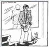
The irony is, I like these comics so much I tend to want to contribute to them (as with Sporadic), thus diluting the geographical aspect that is one of the attractions. When Owen Heitmann announced his intention of resurrecting the Adelaide comics anthology Fist Full of Comics (as appropriately suggested in his eye-catching front cover design, coloured by Loren Morris - see at left) - I had to submit something!
The first volume of Fist Full of Comics was from some years ago, helmed by David Milne, then Sarah Milne and Dan McGuiness (who are still present in this new issue). This new 24 pager features comics by about 10 local artists, along with a couple of text pieces to lend it some zineiness. It is currently available in Adelaide from Pulp Fiction Comics (34A King William St) or by mail order for $3 plus $1.50 postage from fistfullofcomics(at)gmail(dot)com.
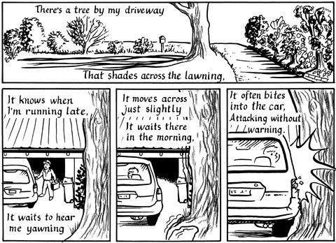 The piece I submitted is a two pager, that happily ended up in the middle. This is a poem that I think has been misunderstood (and rejected) elsewhere in the past so I took the opportunity to revise some lines, particularly the end, to clarify its metaphorical aspects. While I've written a lot of songs, this particular piece was only ever really intended to be (not very good) poetry, and I think illustrating it has added something it needed :).
The art is a contrast of styles, between pure black-and-white linework and gritty textures for the tree itself, though all scanning was initially done in 2bit b&w. I think the result captures the look I was after.
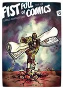
I also knocked out a quick cover design, just in case :). This picture ended up on the back cover. The challenge was to design allowing for the required white border space - something I tried to integrate into the picture. I took the opportunity to experiment. I wanted to represent the concept, and work with flat colours and a limited palette towards a silkscreen print look. The basic design is a bit like a children's book illustration, but I tried to keep it mostly non-linear.
My one reservation about the anthology itself is that, due to the nature of the pieces, it necessarily has a MA (Mature Audience) rating, which means that the readership will be limited. This is often a problem for Australian comics - The Ink #2 copped this rating due to only one story, and a one pager at that. It was a fine piece, but meant that the issue (and the set) couldn't be sold so easily. Artists need a great deal of freedom, but this audience limiting factor is a dilemma for small-press works.
There is plenty to like in FFoC though, with Delta's A Brief Summary of Twilight being a particular favourite, and one piece I had to show to J, who really appreciated it!
If you're producing comics in Australia at the moment, I strongly recommend that you support this comic/zine and submit something - next issue submissions are required by the last week of March, for publication in early April - see guidelines. Go to it!
Labels: Australian comics, Comic anthologies, Fist Full of Comics
Comments:
Post a Comment

![]()