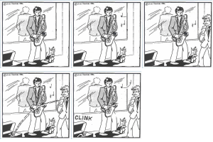
Friday, May 26, 2006
Sorry for Illustration Friday
Monday, May 22, 2006
Recent animal album covers 4

Here's another bunch of Animal Album Covers, showing that birds and rabbits are still going strong. However, the trend isn't limited to just birds, deer, rabbits and tigers by any means - below I'll focus just on bears and tortoises!
The four above are:
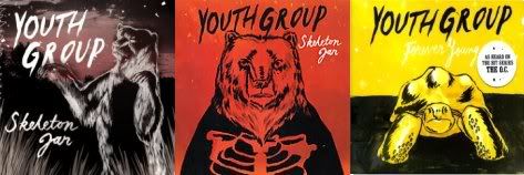
Onto more bears and lots of tortoises... Local band, Youth Group, appear (like The Grates in my last installment) committed to the animal covers theme. Here's two versions of the cover to their first album, Skeleton Jar, the original and the creepier looking Australian rerelease, followed by the cover to their extremely fine single, Forever Young (doing a lot of rotation at our house).

Getting back to tortoises, here are some obscurities from the last several years:
Oddly enough, the band, Tortoise, have never featured one on any of their album artwork, as far as I know.
Labels: Animal album covers
Tuesday, May 16, 2006
Angels & Devils for Illustration Friday
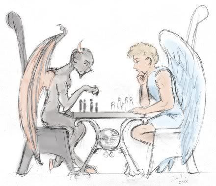
It's all just fun, fun, fun with those guys!
I thought I wouldn't get anything for this topic for Illustration Friday, but this came into my head last night, so I scribbled it out quickly in pencil, scanned it and added some colour in Photoshop. This is pretty much an unfinished sketch - I had planned to work it up further, but Jill said that it could lose something with doing that, and I think she was right.
If you're interested in children's book illustrations, please check out the next post on the main page...
Labels: Illustration Friday, Sketchbook
Saturday, May 13, 2006
What Bugs Me About the New Ladybird Books
 A Review of Some "New" Ladybird books
"These are the original Ladybird retellings, with beautiful new pictures of the kind children like best - full of richness and detail"
- (from the back cover of the current editions)
Hmm, well no, they're not really the original retellings, the pictures aren't exactly new, and the richness of detail is very much diminished from the true originals.
When we were in Borders a few days ago, Jill pointed these new Ladybird books out to me, and we got down the old versions at home to compare.
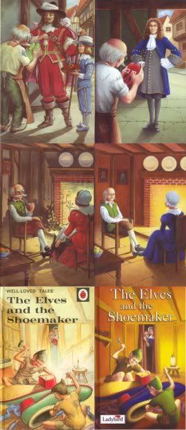
In the left columns of these pictures, you'll find some (fairly randomly selected) pages from the old (1964 & 1965) Ladybird editions of Sleeping Beauty, Cinderella and The Elves and the Shoemaker, illustrated by Eric Winter (the first two) and Robert Lumley. To the right of each are pictures from the new Ladybird books of the same titles, by new (credited) illustrators. Nowhere is there any mention of Winter or Lumley.
The startling similarities between the compositions and much of the detail in the two sets of illustrations is doubtless intentional - I have to wonder what sort of brief the new illustrators were given for this assignment. Interim editions did feature entirely new illustrations, but the latest ones are very evidently drawn on the editions from the sixties.
I'll return to the illustrations further down.
Now to the writing... The authorship is still credited to Vera Southgate, M.A., B. Com., but - in contradiction of the claimed "original Ladybird retellings," these have been edited fairly substantially in places.
With entire sentences merged or altered, and much dialogue removed, the overall the feeling is of Bowdlerisation - a removal of a fair amount of subtlety and resonance (not to mention several pages in each book). Originally, this Ladybird Series, 606D, was a series of graded "Easy Reading" books set at different levels. Page count cuts and the need to standardise the level of the text in some cases may have been factors, but the author statement remains unchanged (with no statement regarding editor).
 Parts of the alterations of both text and illustration are evidently for the purpose of modern sanitisation. In the case of Cinderella for example, the opening changes "elder sisters" to "stepsisters."
Some illustrative examples (see below) are the removal of the Shoemaker's pipe and the replacement of his unsafe candle with a lamp. And then there's the neat-as-a pin look of the Elves' clothes - not a patch in sight anymore - although their clothing remains described as "old" and "ragged" in the text.
The illustrations in the new versions have lost a lot of detail (ie: compare Cinderella's dresses, or the plates in the background of the Shoemaker's house), not to mention character. In addition, they seem to draw from the original illustrations in a grimly literal way that stifles the potential creativity of the new artists.
Sometimes it appears that the illustrators failed to properly comprehend the original picture they were emulating, but place a hand gesture or object there in any case. Most fascinating of all are the small touches, such as the Lady second-from-left in the bottom Sleeping Beauty picture above, whose hair is shaped to recreate the headpiece of the Lady in the earlier picture. And the Shoemaker's wife remains taller in the cover picture (below), as it slavishly recreates the older picture - in the earlier book she was in fact taller, but in the new edition, apart from this picture, she is shorter than the Shoemaker.
With only one source, buildings and costumes lose those pesky augmentations and become blurry - much is lost and nothing appears to be gained (apart from an updated look). Worse, the sense of historical setting carefully composed in the originals has become a hotch-potch of styles and periods.
Building and character elements are sometimes moved around or even merged (parts of two older pictures being used to construct the "new" one).
Another modern touch is the portrayal of characters, both the lead roles and supporting characters, as being much younger (most evident in the Cinderella).
That said, Ladybird books are still a fine format, the retellings are better than average (even for having been altered to their detriment), and the illustrations better than typically cartoony fairy-tale hackwork. Most of the credit for the illustrations must remain with the uncredited Winter and Lumley though - the artists responsible for those original visions, compositions and details.
With more titles yet to be reworked in this series, we'll be watching with interest...
(Images Copyright, Ladybird Books Ltd.)
Labels: Children's books
Thursday, May 11, 2006
Operation Funnybone in The Age
There's an excellent article about Operation Funnybone in The Age newspaper today, featuring an interview with Holly Shorland, along with some sample artwork. If you can't get a print copy, please read the article here: Real Comic Book Heroes, and consider buying a copy of the book!
Holly's work is wonderful - personal and poignant, telling powerful stories using an unconventional and highly appealing collage technique. I had the good fortune to preview some of what's she's currently working on and can't wait to read it all! Her piece in Operation Funnybone - Drip, Drip, Drip - is reason enough that you should own this book...
Holly's work is wonderful - personal and poignant, telling powerful stories using an unconventional and highly appealing collage technique. I had the good fortune to preview some of what's she's currently working on and can't wait to read it all! Her piece in Operation Funnybone - Drip, Drip, Drip - is reason enough that you should own this book...
Labels: Operation Funnybone
Tuesday, May 09, 2006
Attack of the Killer Tomato Sauce Bottle
The last couple of weeks have been a low point in terms of work, comics and family (H and R having problems), but I'm not going to Blog about any of that. However...
Tonight I had a really nasty and unpleasant surprise. L said she couldn't open the new Lite Tomato Sauce bottle, so would I please do it for her?
I unscrewed the lid and then looked at the sealed top... closer and closer, because it was doing something fascinating - sort of bulging, bigger and bigger... Then the top blew off - BANG - hitting me right in the eyes with the top, a blast of gas and sauce! The Lite sauce must have fermented in the bottle (due to low salt and high sugar), building up pressure. There was sauce everywhere, my clothes and hair, the kitchen, but mostly in my face and eyes.
It hurt my eyes something shocking and they're still stinging now, hours later, particularly my Big Red right eye. Ouch! I know I'm given to unintentional slapstick but I really didn't see this one coming.
--------------------
Update two days later: I sent the company an email last night, and this morning they phoned up to apologise, requested details of the batch number and place of purchase, and said they'll send us a hamper (they said they believe in the goodness of their products and apart from this one exception, I agree).
Thursday, May 04, 2006
Rock 'N' Roll Fairies, Part 10
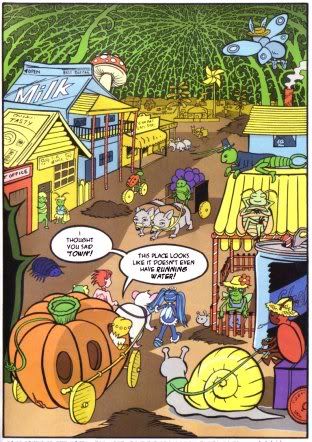
The May issue of Total Girl magazine is out now.
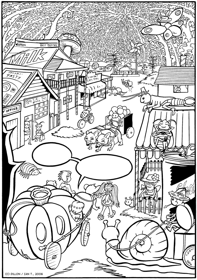
Here's the second page of this episode of Dillon's Rock 'N' Roll Fairies, drawn by me, with colours by Tamara. I'm really pleased with how this page came out, as getting the balance in the details right was tricky (I had old milk cartons and stuff lying around the floor while I was drawing it).
This was a lot of fun to draw, combining my interests in bugs and old country towns. Some of my favourite details are in the far background.
Below is a scan of the original black-and-white page, sans colouring and lettering, so you might want to colour it yourself (or even caption it a bit differently).
Labels: Rock 'N' Roll Fairies
